











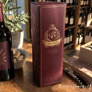


Board, Print and Finish: How Your Box Gets Its Look and Feel
· 34 min · The Vorex Packaging Podcast
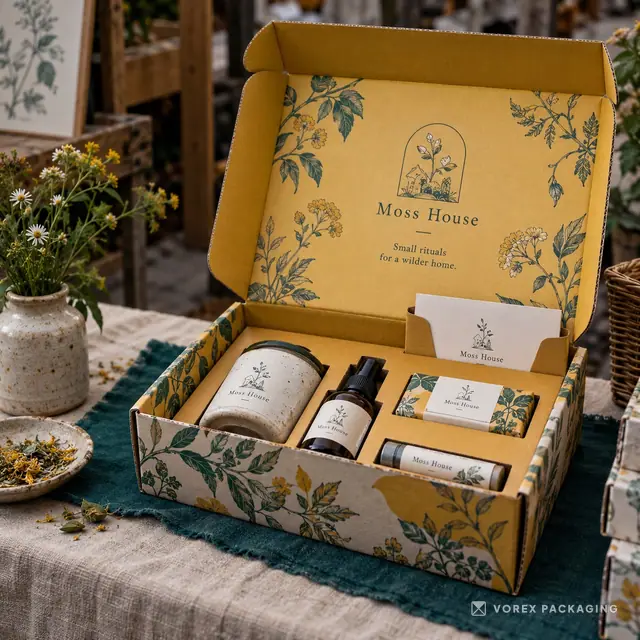
In episode two, Maya and Jordan slow down the three decisions that give a box its look and feel: the board (SBS paperboard, kraft, corrugated flutes and rigid chipboard), the print (CMYK, Pantone spot colors, digital, offset and flexo, and why colors look darker on kraft), and the finish (matte and gloss coatings and laminations, soft-touch, spot UV, foil stamping, embossing and windows). Then three real stories from public sources: the Hermès orange box that began with a wartime packaging shortage, IKEA's 2021 plan to move its consumer packaging from plastic to paper, and Apple's 2026 report on fiber-based packaging.
Player not loading? Spotify's player isn't available in every country. Open the episode on Spotify, or read the full transcript below.
In this episode
- Pick the board from the product's journey: paperboard for shelves, corrugated for shipping, rigid for gifts people keep; then white or kraft for the look.
- SBS is a smooth bleached white board that prints bright, sharp color; kraft is unbleached, natural and textured.
- Thinner flutes (like E flute) give a slimmer wall and smoother print surface; thicker flutes (like B flute) add cushioning and stacking strength.
- CMYK builds colors from four process inks; a Pantone spot color is one ink mixed to a formula for an exact brand shade.
- Inks are slightly transparent, so colors print darker and more muted on kraft. Design for kraft, or ask about a white underlay.
- Check a proof, design on the dieline, add bleed, keep a safe zone, and read every word on the box out loud.
- One or two finishes used well usually beat four finishes fighting each other. Ask for each finish to be listed separately in your quote.
- Hermès: a color chosen out of wartime necessity became a signal through consistency.
- IKEA and Apple: look at small components (trays, inserts, wraps), make boxes easy to recycle at home, and keep claims specific.
Chapters
- 0:00 Cold open
- 1:02 Welcome to the show
- 2:16 The board: what your box is made of
- 7:18 Printing and color
- 12:51 Finishes that change the feel
- 18:22 Real stories: color and paper
- 28:18 Question: one finish on a budget
- 32:04 Get started
Sources
The story segment uses public sources only. We paraphrase and state only what each source supports.
- Hermès: A Shortage of Product Packaging During WWII Led to the Birth of Hermès' Famous Orange Color Mark (The Fashion Law, 22 May 2020, read 9 Oct 2026). Pre-war cream/beige boxes; 1942 shortage in Paris; the only available packaging was orange and Hermès chose it over no packaging; registrations in some countries; EUIPO refused the orange color mark in 2005.
- Hermès: The history of the most iconic color of luxury: How the orange nuance was chosen as the symbol of Hermès (nss magazine, 7 Jun 2020, read 9 Oct 2026). Cream-colored boxes before the war; 1942 shortage; supplier had orange boxes; Émile-Maurice Hermès accepted them and added a brown ribbon and a logo.
- IKEA: IKEA aims to remove plastic from consumer packaging by 2028 (Packaging Gateway, 24 Nov 2021, read 9 Oct 2026). Plan announced November 2021: new range by 2025, running range by 2028; focus on paper (recyclable, renewable, widely recycled); plastic under 10% of packaging volume; possible food-range exception; quote from IKEA's packaging development lead.
- Apple: Apple accelerates progress with highest-ever recycled material in its products (Apple Newsroom, 16 Apr 2026, read 9 Oct 2026). Transition to 100 percent fiber-based packaging completed in 2025; plastic screen protectors and trays replaced with paper versions over ten years; largest boxes collapse to fit a home recycling bin; more than 15,000 metric tons of plastic avoided in five years (Apple's figure).
- National Retail Federation: NRF Halloween Survey Shows Consumer Spending Expected to Reach $13.5 Billion (NRF, 22 Sep 2026, read 9 Oct 2026). US Halloween spending expected at $13.5 billion vs last year's record $13.1 billion; 96% plan to buy candy, $4.1 billion on candy; 49% plan to start shopping in September or earlier; 7,889 consumers surveyed Sept. 1-9.
- US Federal Trade Commission: Guides for the Use of Environmental Marketing Claims (Green Guides) (FTC, 2012 revision, read 9 Oct 2026). US guidance on environmental marketing claims such as recyclable and compostable.
Packaging mentioned
- Kraft packaging
- SBS paperboard boxes
- Corrugated boxes
- Rigid boxes (chipboard)
- E flute vs B flute
- Kraft vs white boxes
- Offset vs digital printing
- Matte vs gloss lamination
- Soft-touch lamination
- Spot UV
- Foil stamping
- How to prepare artwork for custom boxes
- Halloween packaging
- Thanksgiving packaging
- Belly bands
- Stickers
- Window boxes
- Mailer boxes
Get a quote Try the 3D design preview
Full transcript
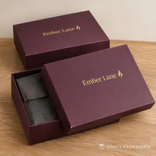
0:00 Jordan: Here's a little experiment. Take one logo. Print it on a plain white carton, then on a natural kraft mailer, and then stamp it in gold foil on a dark rigid box.
0:11 Maya: Same logo, same words. But you would swear those were three different companies.
0:16 Jordan: Exactly. One feels clean and clinical, one feels handmade and natural, and one feels like a gift you shouldn't open until your birthday.
0:25 Maya: And almost none of that comes from the logo itself. It comes from three decisions most people make in a hurry, near the end, when they just want to get their order in. The board, the print and the finish.
0:36 Jordan: So today we are slowing those three decisions down. What the different boards actually are, how printing changes your colors, and which finishes are worth paying for.
0:47 Maya:
0:57 Jordan: Welcome to The Vorex Packaging Podcast. I'm Jordan.
1:01 Maya: And I'm Maya. Welcome back, and welcome if this is your first time with us. This is a show for people who make and sell things. Bakeries, candle makers, skincare founders, coffee roasters, online stores, and anyone who puts a product in a box.
1:17 Jordan: In episode one we talked about what a box says before it's opened. This time we are going one layer deeper, into what the box is actually made of, and how it gets its look and feel.
1:29 Maya: Our house rules still apply. When we talk about a real brand, it comes from a public source, and the links are in the show notes. When we use an example that isn't real, we will say it is a hypothetical.
1:41 Jordan: And if you hear a number, it has a source. Today there are a few, mostly in the story segment and the Halloween part.
1:48 Maya: One more thing up front. We won't quote prices or production times on this show. Those depend on the exact box, the size, the quantity and where it ships, so the honest answer is always the one in your quote.
2:03 Jordan: Here's the plan. First, the board. Then printing and color. Then finishes. After that, our story segment, then the season, a question about finishes on a budget, and how to get started.
2:14 Maya: Let's get into it.
2:20 Jordan: Let's start with the board, because everything else sits on top of it. Maya, when people say cardboard, they usually mean a few very different things, right?
2:29 Maya: They do. In everyday speech, cardboard covers almost everything. But in packaging there are really three big families. Paperboard, corrugated board and rigid board. Each one behaves differently, and each one suits a different job.
2:44 Jordan: Start with paperboard.
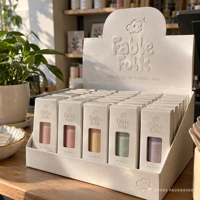
2:45 Maya: Paperboard is the single, fairly thin layer you see in most retail cartons. Think of a box for a serum, a tube of lip balm, a tea box, or a candle box on a shop shelf. It folds flat, it is light, and it prints beautifully.
3:00 Jordan: And within paperboard, the name people will hear a lot is SBS.
3:04 Maya: Right. SBS stands for solid bleached sulfate. In plain English, it is a bleached white board with a smooth surface. Because it is white and smooth, colors print bright and sharp on it, which is why so many cosmetics and supplement boxes use it.
3:20 Jordan: So if your brand has bright colors or fine detail, white paperboard is the natural starting point.
3:26 Maya: It usually is. The trade-off is that paperboard on its own is not a shipping box. It protects the product on a shelf and in a bag, but it is not designed to survive a delivery truck by itself.
3:39 Jordan: Then there's kraft, which is the brown board everybody recognizes.
3:43 Maya: Kraft is unbleached, so it keeps the natural brown color and a visible fiber texture. People choose it because it looks honest and handmade. It suits coffee, soap, candles, bakery, and brands that want a simple, natural feel.
3:57 Jordan: I'd add that kraft is a look as much as a material. You can have a kraft mailer, a kraft carton, or a rigid box wrapped in kraft paper.
4:06 Maya: That's a good point. Kraft describes the color and the paper, not the structure. And we will come back to kraft in the printing part, because it changes how your colors come out.
4:16 Jordan: The second family is corrugated. This is the one that actually travels.
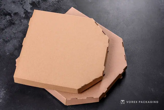
4:21 Maya: Corrugated board has a wavy layer in the middle, called the flute, glued between two flat sheets, called liners. That shape makes it stiff and light at the same time, a bit like a bridge. It is what most mailer boxes and shipping boxes are made of.
4:36 Jordan: And flutes come in different sizes, which is where the letters come in. E flute, B flute and so on.
4:42 Maya: Yes. You don't need to memorize the alphabet. The main thing to know is that a thinner flute, like E flute, gives a slimmer wall and a smoother surface for printing, which is why it is popular for printed mailer boxes. A thicker flute, like B flute, gives more cushioning and stacking strength for heavier products.
5:01 Jordan: So the question to ask is not which flute is best, but what's going in the box and how it's traveling.
5:07 Maya: Exactly. A light skincare set in a subscription mailer and a heavy set of ceramic mugs are two very different jobs. And for really heavy or fragile products, there is double wall board, which is two fluted layers instead of one.
5:22 Jordan: We have a comparison page on E flute versus B flute on the website, if you want to see them side by side. It's in the show notes.
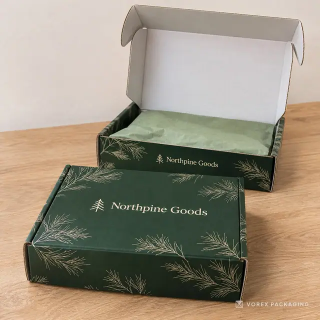
5:30 Maya: One more thing about corrugated mailers that I love. The inside of the lid is some of the best space on the whole box.
5:38 Jordan: Because that's what people see when they open it.
5:40 Maya: Right. Printing the inside can turn a plain-looking mailer into a little reveal. The outside can stay calm, and the inside carries a pattern, a color or a short thank-you line.
5:51 Jordan: Third family, rigid boxes. This is the premium end.
5:55 Maya: Rigid boxes are made of thick, stiff chipboard, wrapped in printed or specialty paper. They don't fold flat like a carton. They keep their shape, and that solid feeling in the hand is a big part of why people associate them with gifts, jewelry, electronics and luxury products.
6:13 Jordan: And they come in a lot of shapes. Lift-off lids, drawer boxes, book-style boxes with a magnetic closure.
6:20 Maya: Yes. The trade-off is space and weight. Because most rigid boxes are built in their final shape, they take up more room in storage and shipping than flat cartons. There are collapsible rigid boxes that fold down, which can help with that.
6:35 Jordan: And people keep rigid boxes, which is a nice side effect.
6:39 Maya: They really do. A good rigid box often ends up holding jewelry, letters or cables on somebody's shelf for years, with your logo on it.
6:48 Jordan: So if I had to sum up the board part in one sentence?
6:51 Maya: Pick the board from the product's journey. If it sits on a shelf, start with paperboard. If it travels by itself, start with corrugated. If it should feel like a gift people keep, look at rigid. Then choose white or kraft for the look.
7:05 Jordan: And when you are not sure, ask for a sample, or ask what the factory would suggest for your product's weight and size. That is a normal question, and a good packaging team will give you a straight answer.
7:22 Maya: Let's talk about color, because this is where a lot of first orders get a surprise.
7:27 Jordan: The surprise being, it doesn't look like my screen.
7:30 Maya: That's the one. Your screen makes color with light, red, green and blue. A printer makes color with ink on board. So there will always be some translation between the two.
7:40 Jordan: Let's start with the basics. CMYK.
7:43 Maya: CMYK stands for cyan, magenta, yellow and black. These are the four process inks. The press lays down tiny dots of each one, and your eye blends them into all the other colors. It is how most full-color packaging is printed, including photos and illustrations.
7:59 Jordan: And then there is Pantone.
8:01 Maya: Pantone, sometimes written PMS, is a color matching system. Instead of building a color out of four inks, a spot color is one ink mixed to a specific formula. Brands use spot colors when one exact shade matters a lot, like a signature brand color.
8:17 Jordan: So if your brand lives or dies by one particular green, that's a conversation to have early.
8:23 Maya: Yes. Tell your packaging team which colors must match and give them the reference. And ask what the printing method can do, because not every method handles spot colors the same way.
8:34 Jordan: Which brings us to printing methods. There are a few you will hear about. Digital, offset and flexo, and sometimes screen printing.
8:42 Maya: Let's keep this simple. Digital printing works a bit like a very big, very good office printer. It prints straight from the file, with no printing plates. That makes it practical for shorter runs, test designs, and orders where you want several versions of the artwork.
8:58 Jordan: So if you want a different design for each scent of candle, digital can make that easier.
9:03 Maya: It often can. Offset printing, on the other hand, uses plates. The ink goes from a metal plate onto a rubber blanket and then onto the board. There is more setup, but for larger repeat runs it is very consistent, and it handles spot colors well.
9:19 Jordan: And flexo?
9:20 Maya: Flexographic printing uses flexible plates, and it is widely used on corrugated board, things like printed shipping boxes. It is a workhorse method for simpler graphics on larger runs.
9:32 Jordan: I think the useful takeaway for a small brand is that you don't have to choose the method yourself. You describe what you need, how many, how many designs, and which colors must match, and the method follows from that.
9:46 Maya: Right. And it's fair to ask your supplier which method they plan to use and why. We also have a page comparing offset and digital printing in the show notes.
9:55 Jordan: Now, you promised we would come back to kraft.
9:58 Maya: I did. Here's the thing about printing on kraft. Most printing inks are a little transparent. On white board, the white underneath makes colors look bright. On brown kraft, the brown shows through, so colors come out darker and more muted.
10:13 Jordan: So a bright pink on white might look more like a dusty rose on kraft.
10:17 Maya: That's a good way to picture it. Black, dark colors and simple one-color logos look great on kraft. Bright, light colors and photos are harder.
10:26 Jordan: Is there a way around that?
10:28 Maya: There are a couple. One is a white ink layer printed under the colors, where the method allows it, so the colors sit on white. Another is to use white board inside and kraft outside, or simply to design for kraft from the start, with a darker palette that looks good on brown.
10:45 Jordan: I like that last one. Instead of fighting the material, design for it.
10:49 Maya: And whatever you choose, look at a proof before production. A digital proof checks layout, spelling, barcodes and where the folds fall. If color is critical, ask whether a physical sample or a printed proof is possible for your order.
11:04 Jordan: A practical tip on artwork, too. Send your logo as a vector file if you have one, and ask for the dieline, which is the flat template of your box, before you design.
11:15 Maya: Designing on the dieline is how you avoid a logo that ends up half on the lid and half on the side. It happens more than you would think.
11:23 Jordan: Can we do a quick artwork checklist? The things that cause the most back and forth.
11:28 Maya: Let's do it. Number one, bleed. Extend your background color or pattern a little past the cut line on the dieline, so there's no thin white edge if the cut lands slightly off.
11:39 Jordan: Number two?
11:40 Maya: Number two, the safe zone. Keep text and logos a little inside the cut and fold lines, so nothing important gets trimmed or bent around a corner.
11:49 Jordan: Three.
11:50 Maya: Three, fonts and images. Convert fonts to outlines, or include them, and use high resolution images, so nothing gets swapped or blurry at print size.
12:00 Jordan: Four.
12:01 Maya: Four, color mode. Set up full color artwork in the four process colors, and name any spot colors clearly, so the printer knows which colors must match.
12:11 Jordan: And five?
12:12 Maya: Five, the boring one that matters most. Read every word on the box out loud, including the small print and the barcode number. A typo on a thousand boxes is a very expensive typo.
12:24 Jordan: I'd add a sixth. Mark your finishes as separate layers. If you want spot UV on the logo or foil on a border, that area should be its own clearly labeled layer in the file.
12:36 Maya: Yes. And if all of that sounds like a lot, it's exactly the kind of thing a packaging team checks with you before anything is printed.
12:43 Jordan: We have a guide on how to prepare artwork for custom boxes on the website. That one's in the show notes as well. Okay, finishes. This is the fun part, and also the part where it's easiest to overspend.
13:01 Maya: It is. So let's start with the most common decision, which is matte or gloss.
13:06 Jordan: Go.
13:07 Maya: Most printed boxes get some kind of protective layer on top of the ink. That can be a coating, like a clear water-based coating, or a lamination, which is a very thin film bonded over the print.
13:19 Jordan: What's the difference between a coating and a lamination, in practice?
13:23 Maya: A coating is a liquid layer that dries or cures on the surface. A common one is aqueous coating, which is water-based and clear. It helps protect the ink from rubbing and scuffs, and it can be matte, satin or gloss. A lamination is a thin plastic film glued over the whole printed sheet before the box is cut and folded. Film usually gives a bit more protection and a more even look.
13:47 Jordan: So a coating is like a clear varnish on a table, and a lamination is like a fitted cover.
13:53 Maya: That's a nice way to put it. And either way, the big visual difference is the shine.
13:58 Jordan: Right, the shine.
13:59 Maya: Right. Gloss reflects light, so colors look rich and saturated, and photos look sharp. It is great for bold, playful brands, toys, snacks, anything that wants energy. The downside is glare under bright lights and in photos.
14:15 Jordan: And matte?
14:16 Maya: Matte is flat and low sheen. Colors look a little softer and calmer, there is no glare, and it tends to read as modern and premium. A lot of minimal and natural brands use it. On very dark colors, matte can show fingerprints, which is worth knowing.
14:31 Jordan: So gloss says energy, matte says calm.
14:34 Maya: As a rough rule, yes. And neither one is better. It's about what your brand should feel like.
14:39 Jordan: Then there's soft-touch, which I think surprises people the first time they hold it.
14:44 Maya: Soft-touch is a matte film with a slightly velvety, almost suede-like feel. People notice it the moment they pick the box up, which is the whole point. It's popular for cosmetics, electronics and premium gift boxes.
14:58 Jordan: Any catch?
14:59 Maya: Like other matte finishes, it can show marks on very dark colors, and it can slightly darken printed colors, so it's worth checking a proof or a sample. And because it's a film, it can affect recyclability in some programs, which we'll come back to.
15:14 Jordan: Now the finishes that add a bit of drama. Spot UV and foil.
15:19 Maya: Spot UV is a clear, glossy coating applied only to chosen areas, like your logo or a pattern, and cured instantly with ultraviolet light. It looks best over a matte background, because then the logo shines and everything around it stays flat.
15:34 Jordan: So you tilt the box and the logo catches the light.
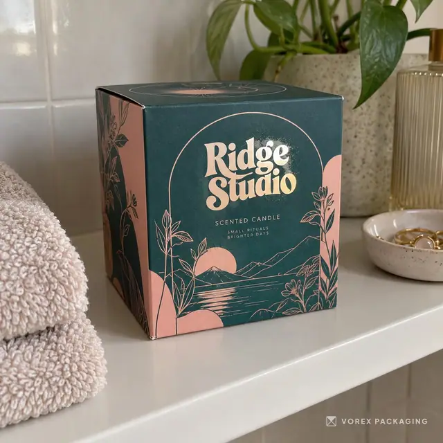
15:38 Maya: Exactly. It's subtle, and it doesn't add another ink color. Foil stamping is louder. A heated die presses a thin metallic or colored foil onto the board, so you get real gold, silver, copper or holographic detail that ink alone can't really copy.
15:55 Jordan: And foil works on kraft, right? I've seen gold on brown boxes.
15:59 Maya: It does, and it's a lovely combination. The natural board with a small metallic logo is a look a lot of craft brands like. The design tip with foil is to keep it to solid shapes and medium-weight text, because very fine lines can fill in or break up.
16:15 Jordan: Then there's embossing and debossing.
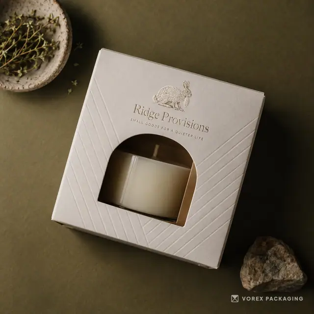
16:17 Maya: Embossing raises part of the design, so it stands up from the surface. Debossing presses it down into the surface. Both add texture you can feel with your fingers, even with no ink at all. A blind emboss, which is a raised logo with no color, is one of the quietest and classiest finishes there is.
16:36 Jordan: And you can combine them. Foil plus emboss gives you a raised metallic logo.
16:41 Maya: You can. Though this is where I'd raise the restraint flag again.
16:45 Jordan: Before the flag, one more. Windows.
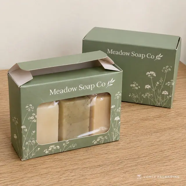
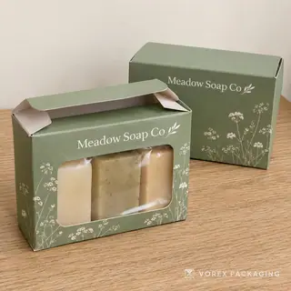
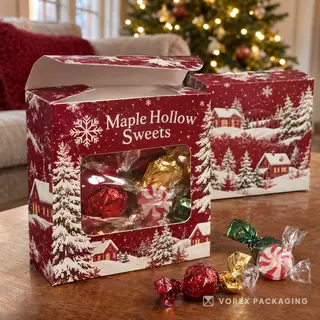
16:48 Maya: Window patching is a die-cut opening with a clear film behind it, so people can see the product without opening the box. It's great for bakery items, macarons, candy, toys, anything that looks better than any photo of it.
17:02 Jordan: Like that macaron box in the window shot. You don't need to describe what's inside.
17:07 Maya: Right. The product does the selling. Just be careful with products that are sensitive to light.
17:13 Jordan: Okay, the restraint flag.
17:15 Maya: Here's my honest opinion. One or two finishes, used well, almost always look better than four finishes fighting each other. Soft-touch plus one foil logo. Matte plus spot UV on the pattern. Kraft plus a small foil stamp. Each of those has one clear idea.
17:32 Jordan: And the more finishes you stack, the more steps there are in production, which usually means more cost and more time. We're not going to put a number on that, because it depends on the order, but it's worth asking about each finish in your quote.
17:46 Maya: And I promised we'd come back to recycling. Plastic films and some metallic finishes can make a box harder to recycle in some local programs. If recyclability matters to your brand, ask about coatings that give you a matte or gloss look without a laminated film, and check your local rules before you print any recycling claim on the box.
18:07 Jordan: Same message as last episode. Keep the claims as careful as the design.
18:12 Maya: We have glossary pages on soft-touch lamination, spot UV and foil stamping, and a matte versus gloss comparison, all linked in the show notes.
18:26 Jordan: Time for our story segment. As always, these are public stories about real brands, and the sources are linked in the show notes. Maya, you've got the first one.
18:37 Maya: I do, and it's one of my favorite packaging stories, because it's about a material decision nobody planned. It's the story of the Hermès orange box.
18:46 Jordan: The famous orange box.
18:48 Maya: That one. According to a 2020 article in The Fashion Law, and a piece in nss magazine the same year, Hermès boxes before the Second World War were not orange. The articles describe cream colored boxes.
19:02 Jordan: So what happened?
19:03 Maya: During the war, in 1942 according to both articles, Paris was dealing with shortages, and Hermès could not get its usual packaging. The supplier still had boxes in one color nobody seemed to want, which was orange.
19:18 Jordan: So the choice was orange boxes or no boxes.
19:21 Maya: That's essentially how The Fashion Law puts it. Hermès chose the orange. And nss magazine writes that Émile-Maurice Hermès accepted the orange boxes and added a brown ribbon and a logo to them.
19:34 Jordan: And it stuck.
19:35 Maya: It stuck. Today that orange box is recognized around the world. The Fashion Law also notes an interesting twist, which is that owning a color is not simple. It reports that Hermès has registrations in some countries, while the European Union's trademark office turned down an application to register the orange color in 2005.
19:56 Jordan: So what's the lesson for a small brand? Because most of us are not going to become Hermès.
20:02 Maya: For me there are two. The first is that a color becomes a signal through consistency, not through the perfect choice. Hermès did not pick orange through a branding workshop. It was the box that was available, and they kept using it.
20:15 Jordan: Which connects to Tiffany from last episode. One color, used for a long time.
20:21 Maya: Exactly. The second lesson is about constraints. Sometimes the material you can actually get, or afford, shapes your look. That's not always a bad thing. A limitation can push you toward something more distinctive than what you would have chosen.
20:35 Jordan: Like designing for kraft instead of fighting it.
20:38 Maya: Right back to the printing chapter.
20:40 Jordan: My first story is about a company that ships an enormous amount of packaging. IKEA.
20:46 Maya: Flat-pack central.
20:47 Jordan: Yes. In November 2021, IKEA announced a plan to phase plastic out of its consumer packaging. I'm going by Packaging Gateway's report from the twenty-fourth of November that year. The plan came in steps. All new products by 2025, and the existing range by 2028.
21:08 Maya: And what did they want to use instead?
21:10 Jordan: Mainly paper. The report says the focus would be on paper because it is recyclable, renewable and widely recycled around the world. It also says plastic made up less than ten percent of IKEA's packaging volume at the time, and that plastic might stay in parts of the food range where it is needed for quality and food safety.
21:32 Maya: That food exception is a really honest detail.
21:35 Jordan: I thought so too. The report quotes IKEA's packaging development lead saying the shift would doubtless be a challenging task in the coming years. And I want to be clear, that was the plan they announced in 2021. We haven't checked how far along they are today, so we're not going to claim they finished.
21:54 Maya: Good. That's exactly the right way to tell it.
21:57 Jordan: Which leads nicely into a brand that did announce it finished. Apple.
22:01 Maya: Go on.
22:02 Jordan: In April this year, on the sixteenth of April 2026, Apple's newsroom published an update on its environmental progress. In it, Apple says it completed the transition to one hundred percent fiber-based packaging last year, fulfilling its pledge to remove plastic from packaging by 2025.
22:23 Maya: Fiber-based meaning paper and board.
22:26 Jordan: Right. And the details are interesting from a packaging point of view. Apple says that over the past ten years its engineers and designers replaced plastic screen protectors and trays with versions made from recycled or responsibly sourced paper.
22:42 Maya: So the little pieces, not just the box.
22:44 Jordan: Exactly. They also say they designed their largest boxes to collapse into smaller pieces that fit into a home recycling bin. And the number they give is that they avoided more than fifteen thousand metric tons of plastic in the past five years. That's Apple's own figure, from its own announcement.
23:04 Maya: What's the takeaway for a small brand, though? Apple has whole teams for this.
23:08 Jordan: Two things, I think. First, look at the small components, not just the outer box. The tray, the insert, the wrap, the sticker. Those little pieces are often where plastic sneaks in, and paper alternatives exist for a lot of them, like paperboard inserts and paper tape.
23:26 Maya: And second?
23:27 Jordan: Second, think about the customer's last step, which is the recycling bin. A box that is easy to flatten, with no glued-on mixed materials, is a box people can actually deal with. That's a small design choice with a real effect.
23:42 Maya: And notice that both IKEA and Apple talked about their claims carefully. IKEA kept a food safety exception. Apple tied its claim to a specific goal and a date. That's a good model for anything you print on your own box.
23:55 Jordan: Every link for these three stories is in the show notes.
24:03 Maya: Let's talk about the season, because it's moving fast.
24:14 Jordan: Which, if you are recording a podcast on a Friday, is three days away.
24:18 Maya: It is. So let's be practical. If you were hoping for brand new custom printed boxes for this weekend, that is probably not realistic. Custom packaging takes time to design, proof, produce and ship, and the honest timeline for your order is the one in your quote.
24:35 Jordan:
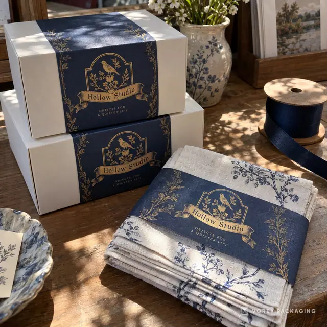
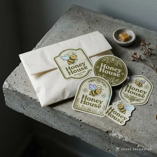
24:39 Maya: Work with what you have. A seasonal sticker on your existing boxes. A printed insert card with a short thank-you note. A belly band, which is a printed paper strip that wraps around a box. Some colored tissue paper. Small touches like these can make a regular box feel seasonal.
24:57 Jordan: It's the second Monday in October.
25:05 Maya: For our listeners in the United States, Thanksgiving is Thursday, November twenty-sixth this year, with Black Friday the next day. That's still a few weeks away, so if you sell pies, baked goods, gift sets or anything for the holiday table, now is a good time to ask for a quote and a timeline.
25:23 Jordan: Work backward from the day you want the boxes in your hands, not the day of the holiday. You need time to fill them, and time for customers to buy before the holiday. And then Halloween, which this year falls on a Saturday, October thirty-first.
25:39 Maya: Halloween is a big deal for food and gift brands in both countries. And there's some fresh data for the United States. The National Retail Federation published its annual Halloween survey on September twenty-second, 2026.
25:54 Jordan: What did it find?
25:55 Maya: The NRF expects Halloween spending to reach thirteen and a half billion dollars this year, up from what it calls last year's record of thirteen point one billion. Candy is still the most popular purchase. The survey says ninety-six percent plan to buy sweets, with about four point one billion dollars expected on candy alone.
26:15 Jordan: Ninety-six percent. Candy really is the center of it.
26:19 Maya: It is. And here's the detail I found most useful. The survey says about forty-nine percent of people planned to start their Halloween shopping in September or earlier.
26:29 Jordan: So by the time October rolls around, a lot of people have already started.
26:34 Maya: Right. For a small brand, the lesson is the same as with Thanksgiving. Seasonal packaging pays off when it's ready early. If this year's Halloween is too close for custom boxes, take notes now for next year, while you can see what sold.
26:49 Jordan: For the record, that NRF survey asked seven thousand eight hundred and eighty-nine consumers in the United States, from September first to ninth. The link is in the show notes.
27:00 Maya: And if you are planning Halloween packaging, the formats that come up again and again are small treat boxes, pillow boxes for favors, gable boxes with handles, window boxes so the treats show, and candy apple boxes with a hole for the stick.
27:15 Jordan: And the finishes we talked about earlier come into play here. A matte black box with orange spot UV, or a purple box with a little foil, can look very Halloween without a single cartoon pumpkin.
27:28 Maya: That's a great idea, actually. A seasonal palette instead of seasonal clip art. And it can look good beyond the night itself.
27:36 Jordan: Let me do a quick hypothetical, and to be clear, this is an example, not a real business. Picture a small cookie shop that sells a box of six every weekend.
27:46 Maya: Okay.
27:47 Jordan: For Halloween, instead of a whole new box, they keep their regular box and add three things. An orange and black belly band, a sticker that seals it, and a small card inside with the flavors. It's quick, it's affordable compared with a new box, and it feels like a limited edition.
28:06 Maya: And then next year, if those limited boxes sold well, they've got real evidence for investing in a fully printed Halloween box.
28:14 Jordan: Exactly. Test with small pieces, then invest in the box. Time for our question segment. Now, honesty first. Our inbox doesn't have a listener question for the show yet, so this week we picked one ourselves. It's a question that follows naturally from today's topic.
28:36 Maya: And if you would like to hear your question on the show, send it to hello@vorexpackaging.com, and tell us it's okay to read it on air.
28:44 Jordan: So here's the question. If I can only afford one finish on my box, which one should I choose?
28:50 Maya: I love this one, because the honest answer starts with a question back. What do you want the customer to do or feel when they first see the box?
28:58 Jordan: Let's go through some cases.
29:00 Maya: Sure. If your box sits on a shelf and has to compete, I'd lean toward the finish that makes your colors work hardest. That might be a gloss or matte coating chosen for your palette, plus a clean design. On a shelf, being readable from a distance beats being fancy up close.
29:16 Jordan: And if it's an online brand, shipped in a mailer?
29:19 Maya: Then I'd skip the outer finish and spend on printing the inside of the lid. The outside of a mailer gets handled by delivery crews and scuffed in transit. The inside is what your customer sees in that first moment of opening.
29:33 Jordan: What about food and treats?
29:35 Maya: For a lot of bakery and candy products, a window is the single most useful upgrade. Your macarons or cookies are the best advertising you have, so let people see them.
29:46 Jordan: And for gifts and premium products?
29:48 Maya: Then one small foil logo, or a blind emboss, can do a lot. Something people feel or see catching the light. Just one, in one place. On a dark matte box, a small gold logo looks very deliberate.
30:01 Jordan: Is there a finish you'd tell people not to start with?
30:05 Maya: I wouldn't tell anyone never. But I'd be careful about starting with a combination of several finishes when you are still learning what your customers care about. You can always add a finish later. It's much harder to explain why version one cost more than it needed to.
30:19 Jordan: And I'd add the obvious one. No finish fixes a box that doesn't fit the product. Get the size and the structure right first, then decorate.
30:29 Maya: Agreed. So the short answer is: shelf brands, make the color work. Online brands, print the inside. Treats, add a window. Gifts, one small foil or emboss. And ask for each finish to be listed separately in your quote, so you can see what each one adds.
30:45 Jordan: Can I sneak in a bonus question? Because it came up in my head during the board chapter. Is kraft always the more eco-friendly choice, just because it's brown?
30:55 Maya: Good one. And the honest answer is, not automatically. Kraft looks natural, and unbleached board skips the bleaching step, but the color alone doesn't tell you the whole story.
31:06 Jordan: So what does?
31:07 Maya: Things like what the board is made from, whether it includes recycled fiber, whether the box is the right size, and what you add to it. A white box that fits the product well and has no plastic film can be a simpler package than a kraft box with a laminated sleeve and a plastic window.
31:25 Jordan: So brown is a look, not a certificate.
31:27 Maya: Exactly. And that matters for what you print. Don't let the brown color make a claim for you that you can't back up. If you want to say something about the material, say what it actually is, and check the current guidance first.
31:50 Jordan: And if you want to see the options side by side, there's a kraft versus white boxes comparison on the website.
31:57 Maya: There is. Pick kraft because you love the look and it suits your brand. That's a perfectly good reason on its own.
32:08 Jordan: That's our episode on board, print and finish. Maya, how can people take the next step?
32:13 Maya: If you are thinking about custom packaging, you can request a quote at vorexpackaging.com/quote. Tell us the box style, the size, the quantity, the board and finish you are curious about, and where it ships, and a packaging specialist will reply with options.
32:30 Jordan: And you don't have to know all the answers. If you're not sure between kraft and white, or matte and soft-touch, say so in the form. That's what the conversation is for.
32:41 Maya: Before you ask for a quote, you can also try the 3D design preview on the website. There's no sign-up. You upload your logo, choose a box shape and color, and see your design on a box you can turn around in the browser.
32:55 Jordan: It's a quick way to see whether your logo works on kraft or white before you decide.
33:00 Maya: And we have a growing set of resources on the site. Material pages for kraft, paperboard, corrugated and rigid boxes, a packaging glossary, and comparisons like matte versus gloss and offset versus digital printing. Everything we mentioned today is linked in the show notes.
33:18 Jordan: A word on how Vorex works. Vorex Packaging is a packaging studio. We help with style, sizing and design, and we print and ship to customers across the United States.
33:31 Maya: We're also still putting together a printed packaging catalog with styles, materials and finishes. It isn't ready yet, and we'll tell you on the show when it is.
33:41 Jordan: If you found this episode useful, follow the show, and share it with a friend who is about to order their first boxes.
33:48 Maya:
33:54 Jordan: Thanks for listening to The Vorex Packaging Podcast. I'm Jordan.
33:59 Maya: And I'm Maya. See you next time.
Voices produced with AI text-to-speech.