Packaging Design Trends 2027: What Small Brands Should Plan
Updated · Vorex Packaging
The packaging design trends small brands should plan for in 2027 are recyclable, single-material structures driven by new US state packaging laws, kraft and natural textures with honest environmental claims, bold color and high-contrast type, fewer but better finishes, right-sized e-commerce boxes, and seasonal sleeves that refresh a design without a full reprint.
How to read packaging trends as a small brand
Most packaging trend lists are written for large consumer goods companies with design agencies and long product cycles. A small brand has different constraints: shorter runs, tighter budgets and a box that often has to work both on a shelf and in the mail. The trends worth following are the ones that make your packaging cheaper to run, easier to recycle, or clearer to the customer. The ones to skip are those that only look good in a render.
The directions below are already visible on shelves, in online stores and in regulation as 2026 closes. None of them requires a large budget, and most can be adopted at your next reorder.
Recyclable, single-material structures
The clearest force on packaging design in the US is regulation. Several states have passed extended producer responsibility (EPR) laws that make producers of packaging responsible for what happens to it after use. California's SB 54, signed on June 30, 2022, sets targets for 2032 that include making single-use packaging recyclable or compostable (CalRecycle, accessed October 6, 2026). Oregon's Recycling Modernization Act took effect in January 2022, with program changes starting in July 2025, and producers of packaged items help pay for the system (Oregon DEQ, accessed October 6, 2026).
For a small brand, the practical response is to make packaging easy to sort. That means paper-based boxes without plastic windows where you can avoid them, paper inserts instead of foam, and paper tape and tissue. Rules and thresholds differ by state and province, so check what applies to you, but a box made of one material is easier to recycle everywhere. Our guide to eco-friendly packaging choices and the glossary entry on recyclable vs compostable explain the options.
Natural textures with honest claims
Kraft board, uncoated stocks and visible fibers continue to signal a natural, considered brand. Custom kraft boxes and eco-friendly boxes fit this look without extra finishes. The shift for 2027 is in the wording. Customers and regulators are more skeptical of vague green language, and the FTC's Green Guides (accessed October 6, 2026) set out how environmental claims such as recyclable and compostable should be qualified and supported. Print specific, checkable statements, such as which parts of the pack go in which bin, rather than broad promises.
Bold color and high-contrast type
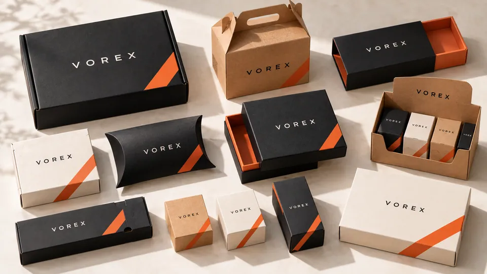
Searches for packaging design trends now include phrases like hyper contrast, and it is easy to see why. Large type, saturated single colors and strong light-dark contrast read quickly in a small online thumbnail and from across a store. For small brands this trend is welcome because it is efficient: one bold color on kraft, or black and one accent on white, can look more intentional than a busy full-color design. Pair a strong color with a clear hierarchy, such as brand, product and one key benefit, and leave the rest for the side panels.
Fewer finishes, placed with intent
Premium packaging is moving away from stacking effects. Instead of foil, embossing, spot UV and gloss on one lid, the direction is a single finish that does one job, such as a foil logo or a tactile soft-touch surface. Our comparison of spot UV vs foil stamping helps you choose. Fewer processes also means fewer materials to separate at recycling and a simpler production run.
Right-sized boxes for e-commerce
Oversized boxes full of filler are increasingly seen as wasteful, and carriers that charge by dimensional weight make them expensive too. Custom sizing is now a design decision as much as a logistics one. Custom mailer boxes made to your product's dimensions reduce filler, protect better and present the product neatly when opened. If you are deciding between formats, see mailer box vs shipping box.
Packaging that explains itself
Customers want to know what is inside, how to use it and how to dispose of the pack, and they want to find it quickly. Expect more brands to use the back and side panels as working space: short usage steps, disposal guidance by component, and a QR code that links to refills, instructions or ingredient details. A QR code also lets you update information online without reprinting the box, which suits small brands whose formulas or offers change often.
Keep the code large enough to scan, with a quiet margin around it, and test it on the final printed proof rather than only on screen. Place the most important information in plain text as well, because not every customer will scan. If you sell in Canada, plan bilingual panels from the start; our guide to packaging labelling basics for Canada covers the essentials.
Modular designs and seasonal layers
Brands are designing a core box that stays the same all year, then adding a seasonal or limited-edition layer on top. A printed belly band, a sleeve box or a custom label refreshes the look for a holiday, collaboration or launch without reprinting the base box. It keeps reorders stable and limits leftover stock when a season ends. Our seasonal and holiday packaging range shows how this works across the calendar.
Industry notes
- Beauty and skincare: clean, typographic cartons suit refill programs and small batches alike. See cosmetic boxes.
- Food and treats: some brands swap plastic windows for printed product photography or a simple cut-out, which keeps the pack paper-based. See food boxes.
- Gifts and candles: keepsake boxes that customers reuse justify a rigid build, while everyday lines lean on lighter folding cartons.
What not to chase
Not every trend suits a small brand. Some cost more than they return, and some create problems later.
- Complex structures for their own sake: unusual shapes look striking but often need custom tooling, ship inefficiently and slow down packing.
- Mixed materials: plastic windows glued to paperboard, magnets in paper boxes or metallic laminates can make a pack harder to recycle.
- Vague sustainability language: words like green or planet friendly without specifics invite scrutiny and add little for the customer.
- Frequent full redesigns: changing the whole box every season resets recognition and adds setup costs. A stable core with seasonal layers is usually smarter.
A useful test for any trend is whether you would still be glad you adopted it in two years. Recyclable materials, clear information and right-sized boxes pass that test easily. A finish or shape chosen only because it is fashionable this season often does not.
A 2027 packaging checklist
- List every material in your current pack and remove any that is not needed.
- Replace plastic inserts and windows with paper options where the product allows.
- Check the environmental wording on your packaging against what you can support.
- Simplify the front panel to brand, product and one key message.
- Choose one premium finish instead of several.
- Measure products again and right-size your shipping packaging.
- Plan seasonal looks as sleeves, bands or labels on a stable core box.
If you want to see how a redesign would come together, our guide on how to choose the right box style is a good place to start, and you can request a free quote for a 2027 version of your packaging.